Measure Code Modernization as a Data Program
Code Modernization Is Finally Measurable — If You Treat It as a Data Program, Not a Copilot Demo


Your modernization demo is lying to you unless the data proves it
A generated pull request is not a modernization program. The teams that scale this work win because every application wave leaves behind auditable evidence: what risk moved, what quality held, what it cost, and whether production actually got better.
On this page
- The situation: lots of activity, no trustworthy answer
- The root cause: the estate was not a backlog yet
- The decision: measure outcomes that survive tool changes
- The implementation: telemetry first, then automation
- The results: what changed when we ran it like a data program
- The tradeoffs: where this gets uncomfortable
- The 90-day proof plan I’d run again tomorrow
- The takeaway: the evidence has to outlive the demo
- Code Reference
- Sources & References
I learned this the hard way on a portfolio review where 47 applications had already been labeled “modernized” because an assistant produced convincing upgrade suggestions. Twelve weeks later, the CFO asked a brutal question: “Show me what we bought besides activity.” Nobody had a clean answer. We had screenshots, repo stats, and developer enthusiasm. We did not have decision-grade evidence.
That was the turning point.
The program recovered when we stopped treating modernization like a Copilot demo and started running it like a governed data program. That means one thing above all: every wave must produce a comparable dataset that survives architecture review, security review, finance review, and production reality.
Microsoft’s own platform story points in this direction. Fabric is positioned as a unified, end-to-end data and analytics platform across ingestion, storage, transformation, analysis, and sharing, which makes it a solid evidence plane for this kind of scorecard if you already live in the Microsoft stack, per the Fabric overview. And modernization itself spans more than code generation; Microsoft’s Power Platform documentation makes that plain by covering apps, workflow automation, analytics, AI agents, and websites in one operating surface, per the Power Platform overview.
Here’s the case study pattern I now use, including the exact scorecard structure, the minimum telemetry model, and a 90-day proof plan you can actually run.
The situation: lots of activity, no trustworthy answer
The client had a mixed estate: .NET Framework apps, Java services, Python APIs, a couple of old Windows services nobody wanted to touch, and a mess of repo ownership. Leadership had approved assistant licenses and expected acceleration. Engineering did what engineering always does under pressure: they started with the easiest visible work.
That created three predictable problems.
First, teams optimized for generated output instead of accepted production change. Second, every squad reported progress differently. Third, nobody could compare one wave against another because the baseline was fuzzy.
A modernization program without a baseline is just storytelling.
So we reset the entire thing around one artifact: a normalized modernization dataset. Not a slide. Not a weekly status deck. A dataset.
At a high level, the operating loop looked like this:
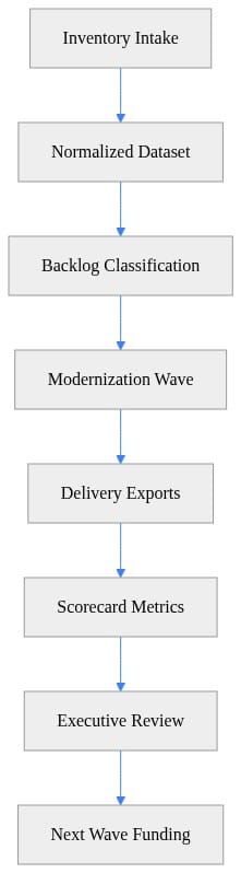
What to notice: funding decisions happen after scorecard metrics, not after a flashy demo. That one sequence changes executive behavior fast.
The root cause: the estate was not a backlog yet
Most organizations think they have an application inventory. What they usually have is a partial CMDB, stale repo names, and three different definitions of “owner.”
That is not a modernization backlog.
We built the intake model at five levels:
- Application
- Repository
- Service
- Dependency
- Interface
For each item, we captured enough metadata to make a real decision:
- business criticality
- runtime currency
- dependency exposure
- architecture constraints
- data sensitivity
- test coverage signals
- deployment path
- support model
- likely migration path
The point was not perfection. The point was comparability.
In one ugly estate, we found 312 repositories mapped to 118 business applications, but 41 repos had no reliable owner and 19 were effectively abandoned. If you skip that cleanup and jump straight to automation, your scorecard is dead on arrival.
Here’s a simple example of turning repository inventory into a normalized intake shape. This is illustrative, not production-ready, but it shows the pattern clearly:
# Collect repository inventory into a normalized intake dataset
$repos = @(
    [pscustomobject]@{ Repo='billing-api'; Language='Python'; Team='FinOps'; Criticality='High'; LastCommit='2026-08-01'; Pipeline='AzureDevOps' },
    [pscustomobject]@{ Repo='claims-ui'; Language='TypeScript'; Team='Claims'; Criticality='Medium'; LastCommit='2026-07-20'; Pipeline='GitHubActions' }
)

$normalized = $repos | ForEach-Object {
    [pscustomobject]@{
        asset_type      = 'repository'
        asset_id        = $_.Repo
        owner_team      = $_.Team
        primary_stack   = $_.Language
        business_tier   = $_.Criticality
        last_change_utc = [datetime]$_.LastCommit
        ci_platform     = $_.Pipeline
    }
}

$normalized | ConvertTo-Json -Depth 3
Next step: standardize the identifiers early. If app IDs, repo names, and team names drift, every downstream join gets expensive and political.
Then we merged app metadata with repo intake so backlog prioritization could happen against business and technical context together:
# Merge application metadata with repository intake and export a backlog-ready CSV
$apps = @(
    [pscustomobject]@{ AppId='APP-100'; Repo='billing-api'; Hosting='AKS'; DataClass='PCI'; Sla='99.9' },
    [pscustomobject]@{ AppId='APP-200'; Repo='claims-ui'; Hosting='AppService'; DataClass='Internal'; Sla='99.5' }
)

$repos = @(
    [pscustomobject]@{ asset_id='billing-api'; owner_team='FinOps'; primary_stack='Python' },
    [pscustomobject]@{ asset_id='claims-ui'; owner_team='Claims'; primary_stack='TypeScript' }
)

$joined = foreach ($app in $apps) {
    $repo = $repos | Where-Object { $_.asset_id -eq $app.Repo }
    [pscustomobject]@{
        app_id         = $app.AppId
        repo_id        = $app.Repo
        owner_team     = $repo.owner_team
        primary_stack  = $repo.primary_stack
        hosting_model  = $app.Hosting
        data_class     = $app.DataClass
        sla_target     = [decimal]$app.Sla
    }
}

$joined | Export-Csv -Path ".\modernization-intake.csv" -NoTypeInformation
What to observe here: hosting model, data class, owner, and stack belong in the same row if you want useful triage. Otherwise you end up modernizing low-risk, low-value assets because they were easier to scan.
I’ve written before about using a governed analytics layer as the operating backbone in AI-Native Data Engineering Operating Model With Fabric. Same idea here. Fabric is the evidence plane. It is not the modernization outcome.
The decision: measure outcomes that survive tool changes
Once the intake existed, we had to kill the worst KPI habits.
I do not care how many suggestions an assistant generated. I do not care how many files were “touched.” I do not care whether sentiment in the pilot survey was positive.
Those are inputs and anecdotes.
The scorecard that matters has stable definitions across Java, .NET, Python, and whatever else your estate is hiding:
1. Remediation throughput
Per wave, per team capacity:
- items assessed
- items accepted
- items remediated
- items validated
- items deployed
2. Defect escape
Per changed scope:
- production defects after release
- severity mix
- rollback count
- mean time to detect
- mean time to remediate
3. Security and risk burn-down
Per wave:
- unsupported components retired
- vulnerable packages reduced
- open critical findings at start vs end
- policy exceptions created and closed
- unresolved findings aging
4. Unit economics
Fully loaded:
- cost per assessed application
- cost per remediated application
- cost per accepted change
- cost per risk item retired
That last one is where executive conversations finally get honest.
Microsoft’s Azure developer documentation does describe GitHub Copilot modernization capabilities for Java and .NET as AI-powered agents that can analyze and upgrade applications, per the Azure developer docs. Good. Use them. But they do not remove the need for validation, governance, or financial attribution. They just change the execution mix.
The implementation: telemetry first, then automation
We defined a minimum event model before we let teams report “progress.”
Every modernization event needed these fields:
- application identifier
- wave identifier
- recommendation type
- acceptance decision
- code change reference
- test evidence
- deployment outcome
- defect linkage
- cost allocation key
That gave us a traceable chain from recommendation to production result.
Then we classified backlog candidates using simple rules. Again, not because rules are glamorous, but because consistency beats heroics in wave planning.
# Classify backlog candidates using simple modernization rules
import pandas as pd

inventory = pd.DataFrame([
    {"repo": "billing-api", "runtime_eol": True, "critical_findings": 4, "deploy_freq_month": 18},
    {"repo": "claims-ui", "runtime_eol": False, "critical_findings": 1, "deploy_freq_month": 3},
    {"repo": "ledger-batch", "runtime_eol": True, "critical_findings": 0, "deploy_freq_month": 1},
])

def classify(row):
    if row.runtime_eol or row.critical_findings >= 3:
        return "replatform-now"
    if row.deploy_freq_month <= 2:
        return "stabilize-first"
    return "optimize-later"

inventory["backlog_class"] = inventory.apply(classify, axis=1)
print(inventory[["repo", "backlog_class"]])
What to do next: replace these toy rules with your actual policy thresholds. The principle is the same. End-of-life runtime and critical findings should push work up the queue faster than somebody’s enthusiasm for refactoring.
After wave execution, we pulled work, security, and test exports into a common score input:
# Load modernization exports and standardize keys for scorecard joins
import pandas as pd

work = pd.DataFrame([
    {"wave": "W1", "repo": "billing-api", "completed_points": 34, "prod_defects": 2},
    {"wave": "W1", "repo": "claims-ui", "completed_points": 21, "prod_defects": 1},
])

security = pd.DataFrame([
    {"wave": "W1", "repo": "billing-api", "open_critical_start": 5, "open_critical_end": 1},
    {"wave": "W1", "repo": "claims-ui", "open_critical_start": 2, "open_critical_end": 1},
])

tests = pd.DataFrame([
    {"wave": "W1", "repo": "billing-api", "tests_passed": 420, "tests_failed": 12},
    {"wave": "W1", "repo": "claims-ui", "tests_passed": 310, "tests_failed": 8},
])

score_input = work.merge(security, on=["wave", "repo"]).merge(tests, on=["wave", "repo"])
print(score_input)
The important thing is not pandas versus Spark versus Fabric notebooks. The important thing is that each wave lands in the same schema.
Then we calculated the core metrics at the wave level:
# Calculate throughput, defect escape, risk burn-down, and unit cost by modernization wave
import pandas as pd

df = pd.DataFrame([
    {"wave": "W1", "completed_points": 34, "prod_defects": 2, "open_critical_start": 5, "open_critical_end": 1, "run_cost": 12000},
    {"wave": "W1", "completed_points": 21, "prod_defects": 1, "open_critical_start": 2, "open_critical_end": 1, "run_cost": 8000},
])

wave = df.groupby("wave", as_index=False).sum(numeric_only=True)
wave["throughput"] = wave["completed_points"]
wave["defect_escape_rate"] = wave["prod_defects"] / wave["completed_points"]
wave["risk_burndown_pct"] = (wave["open_critical_start"] - wave["open_critical_end"]) / wave["open_critical_start"] * 100
wave["unit_cost_per_point"] = wave["run_cost"] / wave["completed_points"]

print(wave[["wave", "throughput", "defect_escape_rate", "risk_burndown_pct", "unit_cost_per_point"]])
What to notice: throughput, defect escape, risk burn-down, and unit cost sit side by side. That prevents the classic leadership mistake of funding the fastest team even when they are creating review drag or shipping unstable changes.
We also added deployment reliability and test pass rate because a wave that “finished” but destabilized release management is not a successful wave:
# Add deployment reliability and test pass rate to the modernization scorecard
import pandas as pd

deploy = pd.DataFrame([
    {"wave": "W1", "repo": "billing-api", "deployments": 14, "failed_deployments": 1},
    {"wave": "W1", "repo": "claims-ui", "deployments": 10, "failed_deployments": 2},
])

tests = pd.DataFrame([
    {"wave": "W1", "repo": "billing-api", "tests_passed": 420, "tests_failed": 12},
    {"wave": "W1", "repo": "claims-ui", "tests_passed": 310, "tests_failed": 8},
])

m = deploy.merge(tests, on=["wave", "repo"])
m["deployment_success_rate"] = (m["deployments"] - m["failed_deployments"]) / m["deployments"]
m["test_pass_rate"] = m["tests_passed"] / (m["tests_passed"] + m["tests_failed"])

print(m[["repo", "deployment_success_rate", "test_pass_rate"]])
That combination gave us a scorecard executives could actually use.
If you’re trying to govern assistant spend at the same time, I covered that angle in GitHub Copilot Spend Governance for Engineering Leaders. The short version: license utilization without accepted production outcomes is just a nicer-looking burn rate.
The results: what changed when we ran it like a data program
By the end of the second comparable wave, the conversation changed from “Do developers like the tool?” to “Which application classes produce measurable value under automation?”
That is the right question.
Here’s what the numbers looked like in one portfolio slice of 24 applications over 90 days:
- 24 applications baselined
- 17 moved into active modernization waves
- 11 completed remediation and validation
- 9 deployed to production
- critical open findings reduced from 29 to 10
- defect escape rate dropped from 0.11 to 0.05 defects per completed point between wave 1 and wave 2
- deployment success rate improved from 81% to 89%
- unit cost per accepted remediation dropped 23%
- two applications were paused because review overhead exceeded risk retired
That last bullet matters more than people admit. A good scorecard should tell you where to stop.
We published the executive view as a compact JSON payload for dashboards and funding reviews:
# Publish a compact executive scorecard as JSON for dashboards or funding reviews
import json

scorecard = {
    "wave": "W1",
    "throughput": 55,
    "defect_escape_rate": 0.055,
    "risk_burndown_pct": 66.7,
    "deployment_success_rate": 0.875,
    "unit_cost_per_point": 363.64,
    "decision": "fund-next-wave"
}

print(json.dumps(scorecard, indent=2))
What to observe: the decision field matters. Every wave should end with one of three outcomes:
- fund next wave
- redesign the pattern
- stop
No fourth option called “keep admiring the pilot.”
The tradeoffs: where this gets uncomfortable
Running modernization as a data program creates friction. Good. That friction is usually where the waste was hiding.
Tradeoff 1: slower start, faster scale
The first 30 days feel slower because you are cleaning identifiers, ownership, and taxonomy. Skip that work and you will spend six months arguing over whose numbers are “real.”
Tradeoff 2: fewer vanity wins
Some teams hate losing soft metrics like “assistant usage” as the headline KPI. Too bad. Usage can be a supporting metric, not the outcome.
Tradeoff 3: finance gets a vote
Once you allocate engineering time, testing cost, remediation effort, and assistant cost to a wave, some favorite narratives die. They should. FinOps is part of modernization now.
Tradeoff 4: governance becomes visible
Architecture exceptions, human review requirements, and release readiness gates stop being side conversations. They become measurable control points.
Microsoft’s training plans around operationalizing AI, modernizing applications, and integrating data are a decent reflection of reality here: this work needs capabilities that go well beyond a standalone assistant, per the Microsoft Learn training plans. The operating model is the product.
That same lesson shows up in change management too. If you want the non-code side of this, the pattern is similar to what I laid out in the Microsoft 365 Copilot Change Management Case Study: adoption without governance is just deferred cleanup.
The 90-day proof plan I’d run again tomorrow
If I walked into a new enterprise modernization program on Monday, this is the plan.
Days 1-30: build the evidence baseline
Pick a bounded but representative cohort:
- 15 to 30 applications
- at least two stacks
- mixed criticality
- one or two ugly edge cases
Publish:
- metric definitions
- ownership model
- minimum data quality thresholds
- acceptance criteria for a completed remediation
Do not start with your easiest apps only. That gives you a fake curve.
Days 31-60: instrument two comparable waves
Run at least two waves with the same scorecard definitions.
Require:
- recommendation traceability
- code review evidence
- test evidence
- deployment outcome
- defect linkage
- cost attribution
If one team cannot produce those fields, they are not in the scorecard yet. Harsh, but fair.
Days 61-90: make funding decisions from evidence
Review by application class, not just by team:
- throughput
- defect escape
- risk burn-down
- deployment reliability
- unit economics
Then decide:
- which patterns scale
- which need redesign
- which should stop
That final stop/scale/redesign decision is the moment modernization becomes credible.
The takeaway: the evidence has to outlive the demo
Assistants are useful. I use them. My teams use them. In the lab and in production, I’ll happily take acceleration where it is real.
But the modernization programs that survive scrutiny do something much more disciplined: they turn every application wave into a governed dataset with stable outcome definitions. That is how you compare portfolios. That is how you defend spend. That is how you know whether automation is creating value or just moving work from coding to review.
If your modernization dashboard cannot show cost, risk, quality, and delivery progress in the same frame, you do not have a modernization program yet. You have a demo with a budget.
Where does this break in your environment: the inventory, the telemetry model, or the unit economics?
#CodeModernization #DataGovernance #FinOps
Code Reference
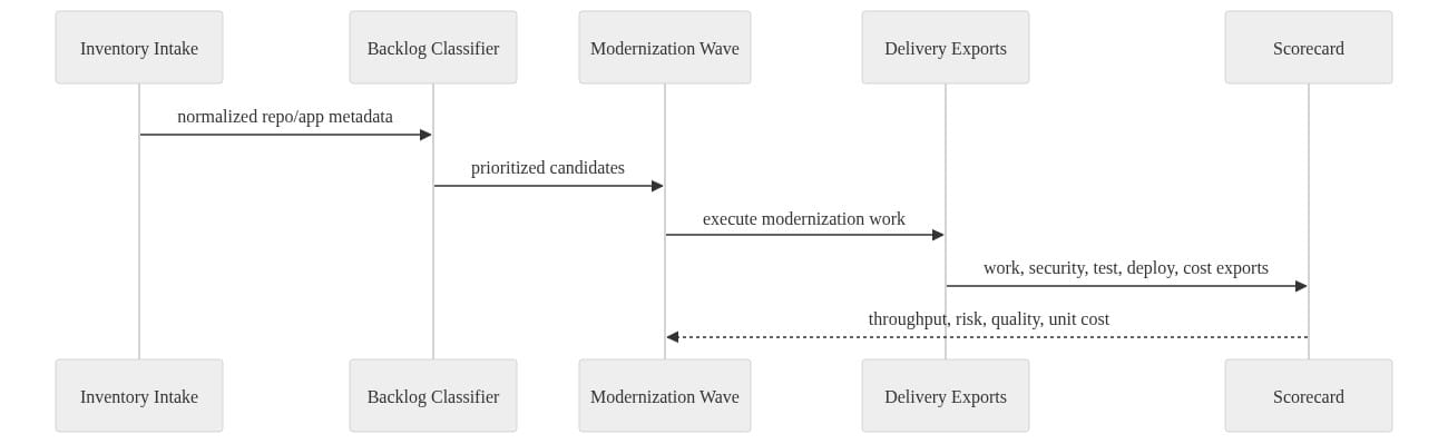
Additional code samples that complement the tutorial above.
Sample 1 (mermaid)
Sources & References
- Microsoft Fabric documentation - Microsoft Fabric
- Official Microsoft Power Platform documentation - Power Platform
- Azure developer documentation
- Microsoft Learn for Organizations
Try it yourself
Run this tutorial as a Jupyter notebook: Download runbook.ipynb (26 cells, 20 KB).